CASE
GLAMOX
Glamox, your source of light
MANUFACTURING INDUSTRY
Glamox, a Norwegian lighting solutions provider, has renewed its logo and visual identity. The main idea of the concept is to represent Glamox as a source of light and smart solutions. Their mission is to deliver sustainable lighting solutions that improve the performance and well-being of people. The Norwegian group is the leading supplier for marine and offshore markets worldwide and professional contractors around Europe.

Gentle renewal
The last time Glamox updated its logo was in 1982, and it no longer reflected the position and ambitions of the company. It was also too detailed, making applying it on digital and physical surfaces difficult. The overall identity required a renewal that shows more personality.
A logo with that much tradition needed to be transformed gently and humbly. The Glamox brand is established in markets worldwide, and it is essential to balance recognition with necessary renewal.
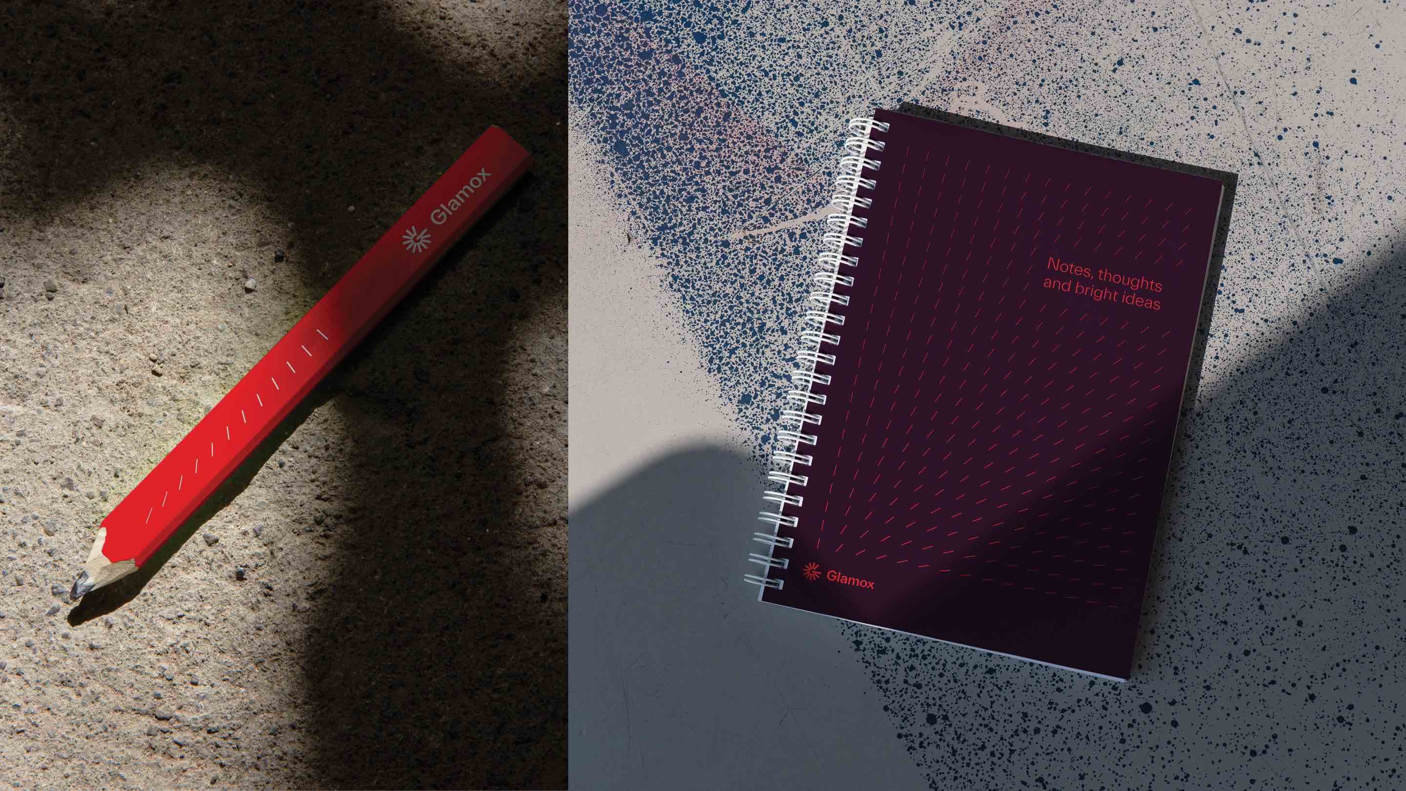
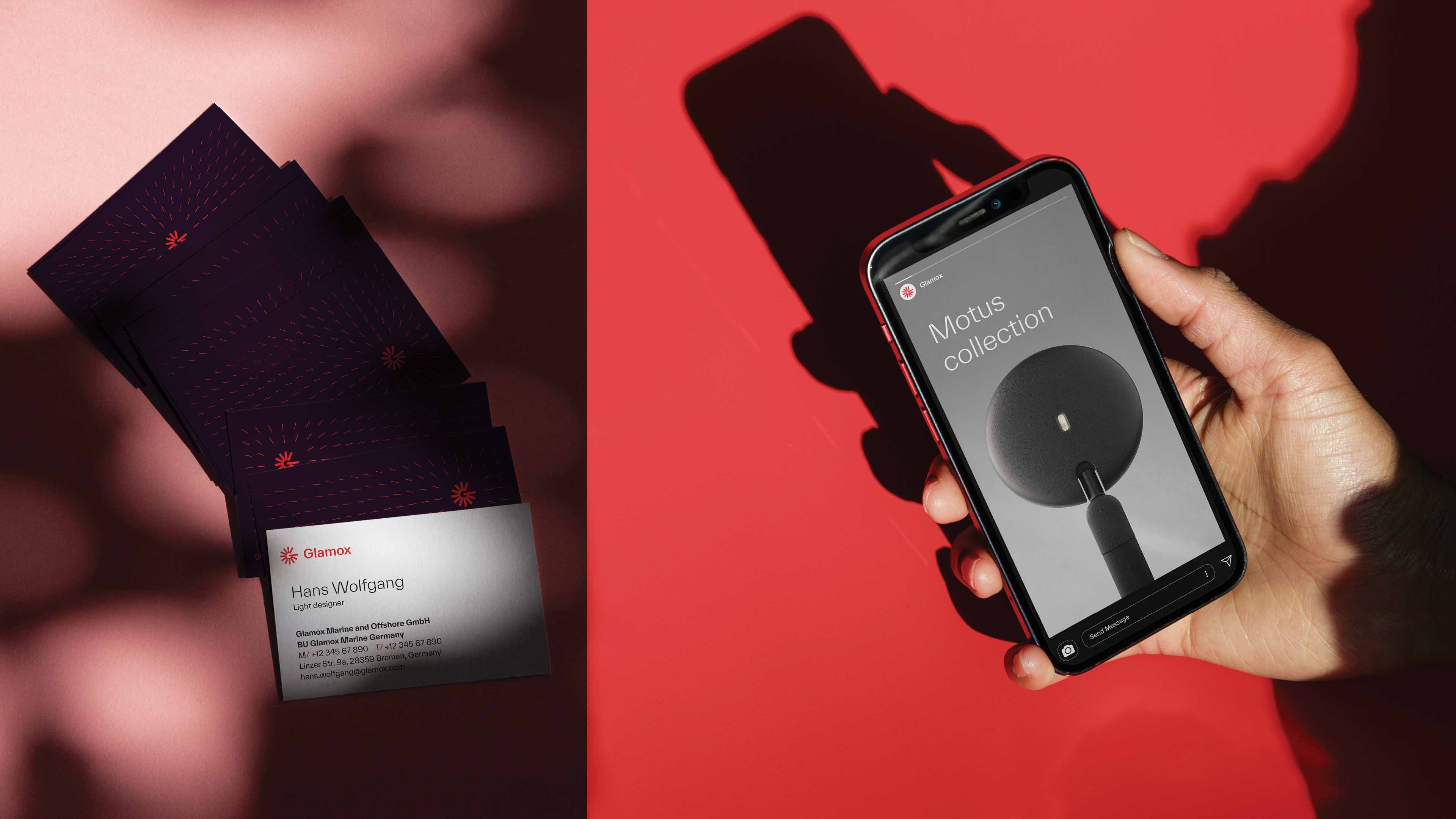
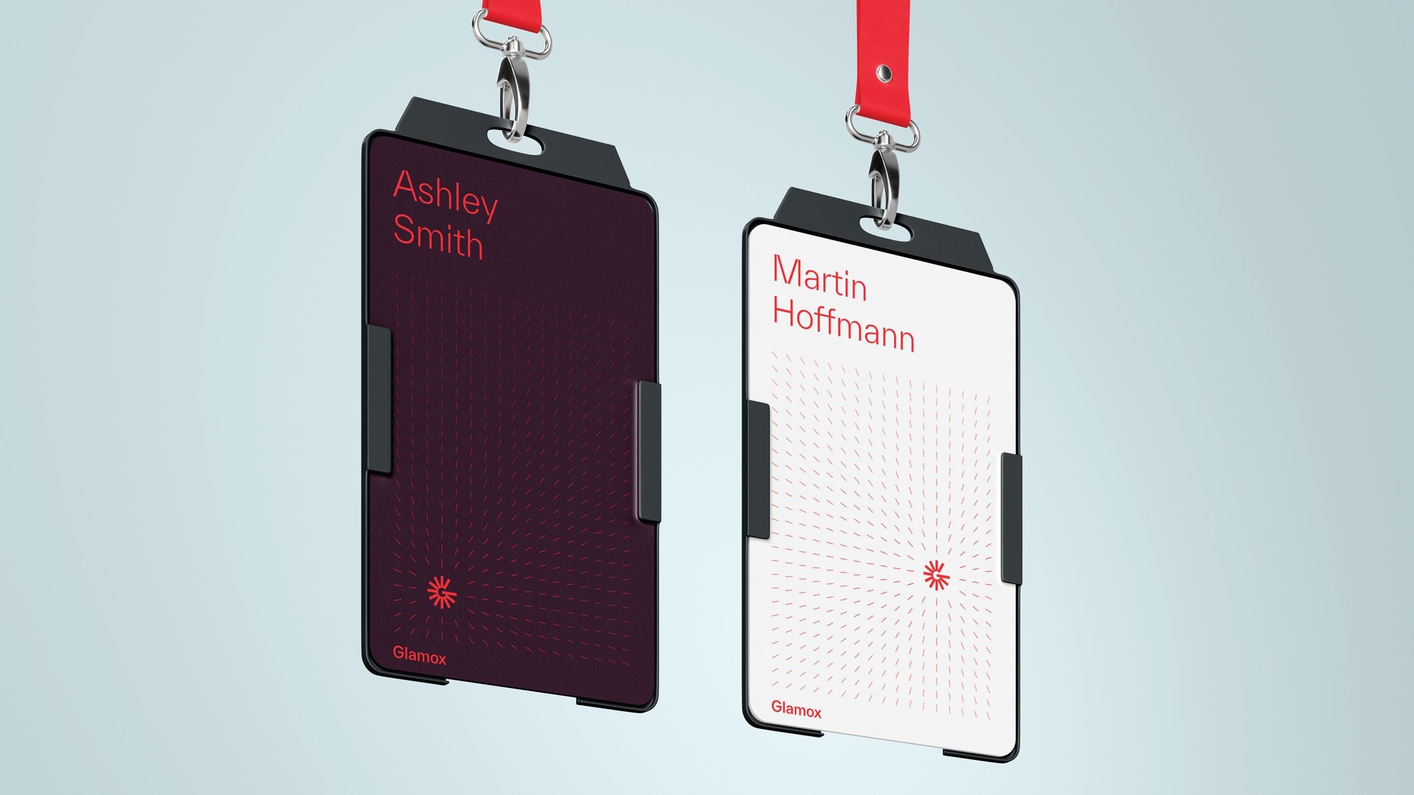
A graphic rendering of light
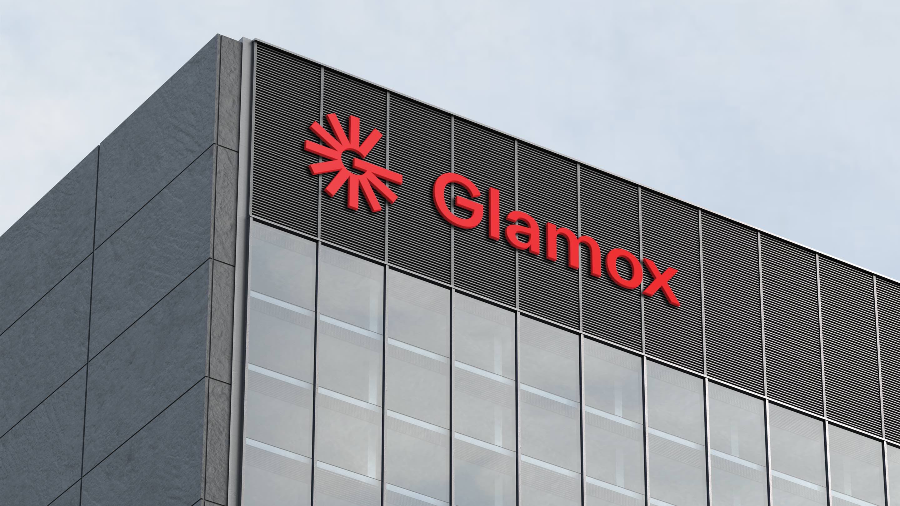
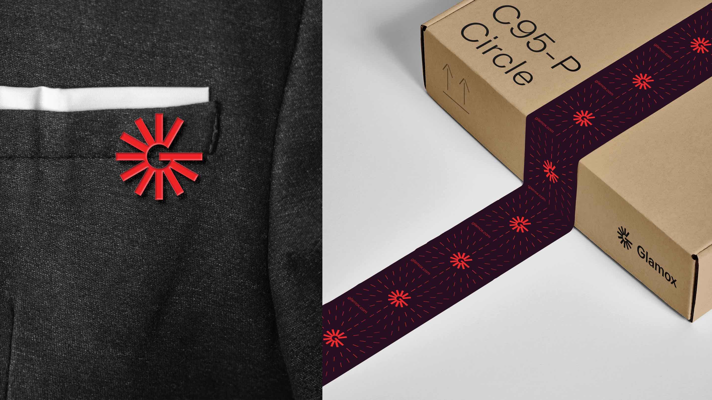
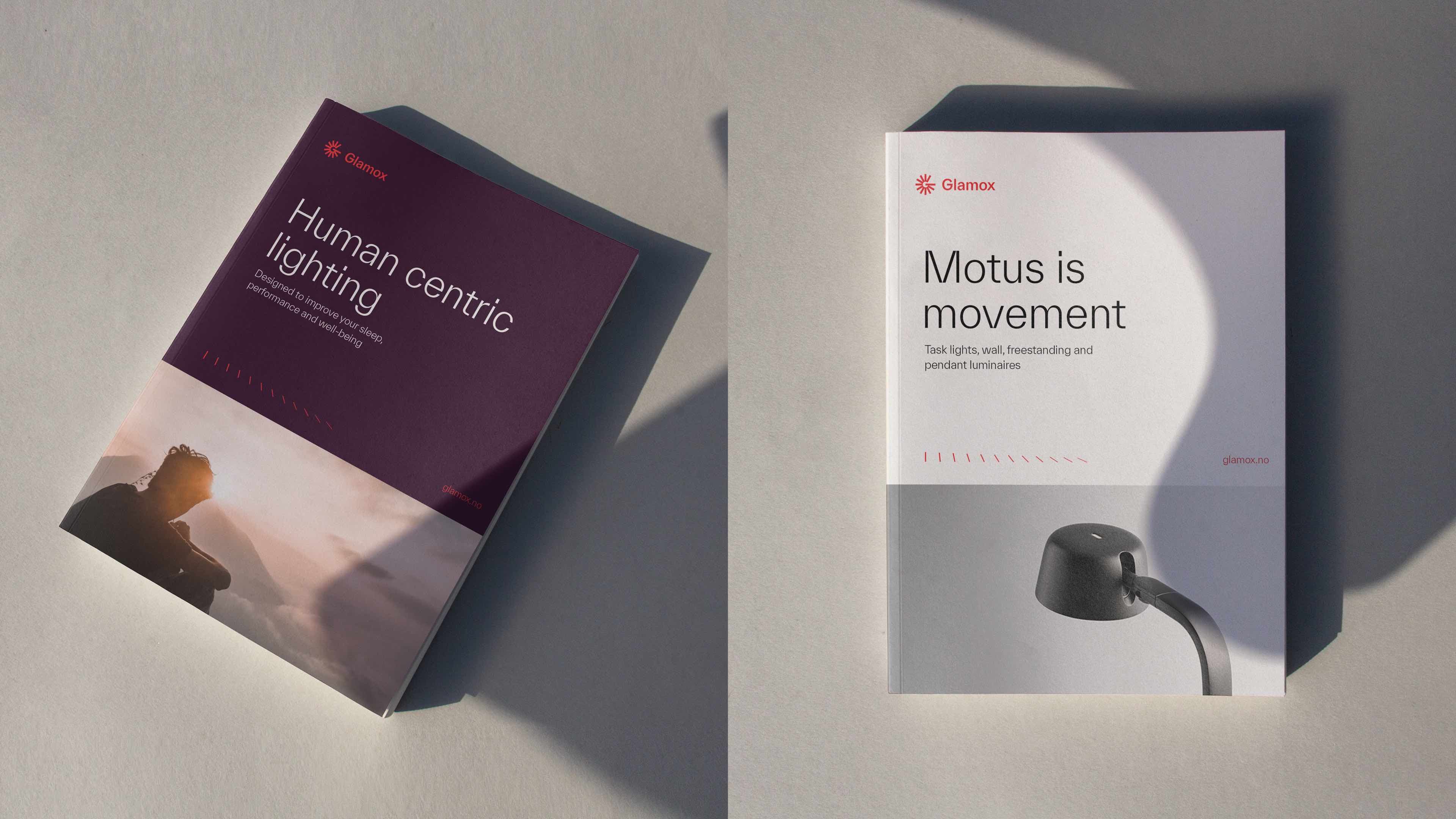
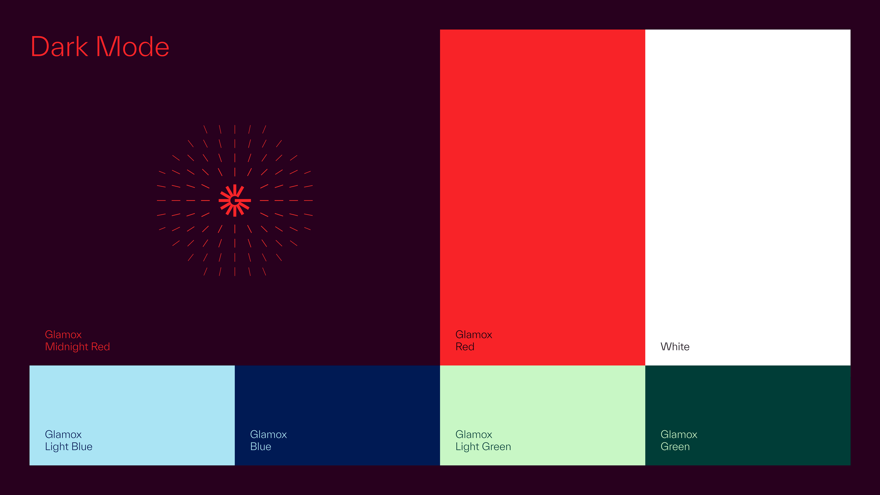
As a graphic rendering of light, the rays flow out of the symbol in digital and analogue surfaces and in motion use. The result is a more timely and dynamic identity that makes Glamox stand out in the international corporate market.
The new logo and identity are meant to express that Glamox is a source of light. Creates associations with the brilliance and positivity in rays while giving a subtle hint to the letter G.
Internal acclaim
In November 2021, the new identity was presented to the 2300 employees of Glamox in 16 countries to wide acclaim. “Fresh”, “modern”, and ”very Glamox” were typical comments. Many employees also expressed that the feeling of pride in working at Glamox was amplified.
Do you want to know how we can assist you?
Give us a call or send a message, and we will get in touch with you.

Urban Nyblom
Business Director
Knowit Experience Stockholm